The following panel style presets are available from the Show Panel drop-down on both the Component and Slide ribbons, and as an option in the Formatting Panel when editing Panel Settings at the slide or panel level. The idea of these presets is that they can be used to improve the appearance of the slides in a single action.
Preset Styles
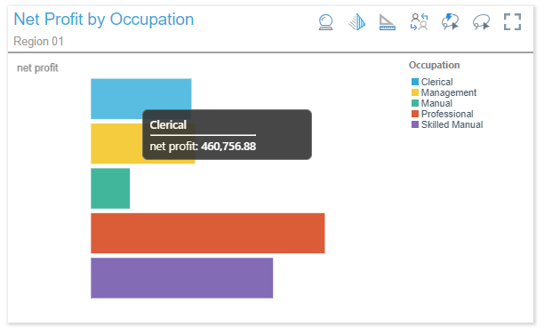
Classic
The Classic panel features square corners and a shadow around the edges, as well as a dividing line beneath the title. The title appears at the top left corner, and the panel tools appear at the top right when hovering over the visual.
Rounded
The Rounded panel features rounded corners and a black outline. The title appears at the top left corner, and the panel tools appear at the top right when hovering over the visual.

Minimal
The Minimal panel features square corners and a shadow all around the edges. The title is hidden, and the panel tools appear as a pop-up above the visual when hovering over it.

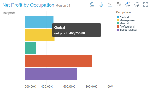
Tiled
The Tiled panel is totally flattened; there is no outline or shadow. The title appears at the top left corner, and the panel tools appear at the top right when hovering over the visual.
Off / Hidden
When the panel is turned off, the title is hidden and the panel tools appear as a pop-up above the visual when hovering over it.

Sanctioned Model
Visuals built from a sanctioned data model display the sanctioned model watermark at the top-left (red arrow):

Note: This feature is not available in the Community Edition.
Legend Formatting
If you've added a legend as a separate visual, you can customize its panel separately from the visual it is associated with.
When editing the formatting options for a legend, you can change the General and Title settings. For more information, see Panel Settings.
Disabling the legend's title moves the legend's components to the top of the legend visualization:
